
Summer 2026 Color Guide: Colori Contrasti
Summer 2026 Color Guide: Colori Contrasti
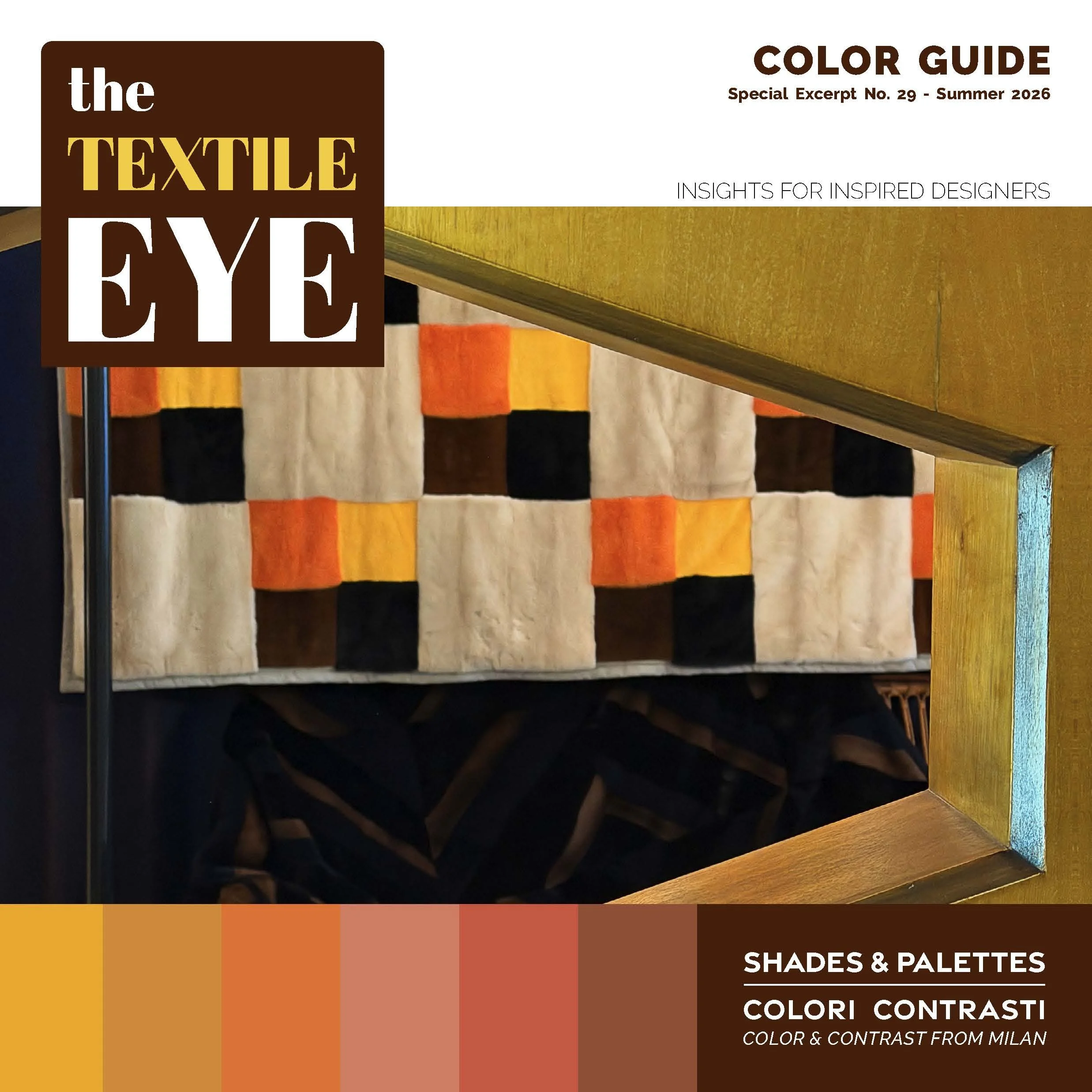
This 50+ page PDF maps the color story from The Textile Eye 29: Summer 2026, Materia Milanese—palettes drawn from Salone del Mobile, FuoriSalone, and the installations across Alcova, Rossana Orlandi, Mosca Partners, and the wider Milan circuit, documented across textiles, furniture, rugs, upholstery, and wallcoverings.
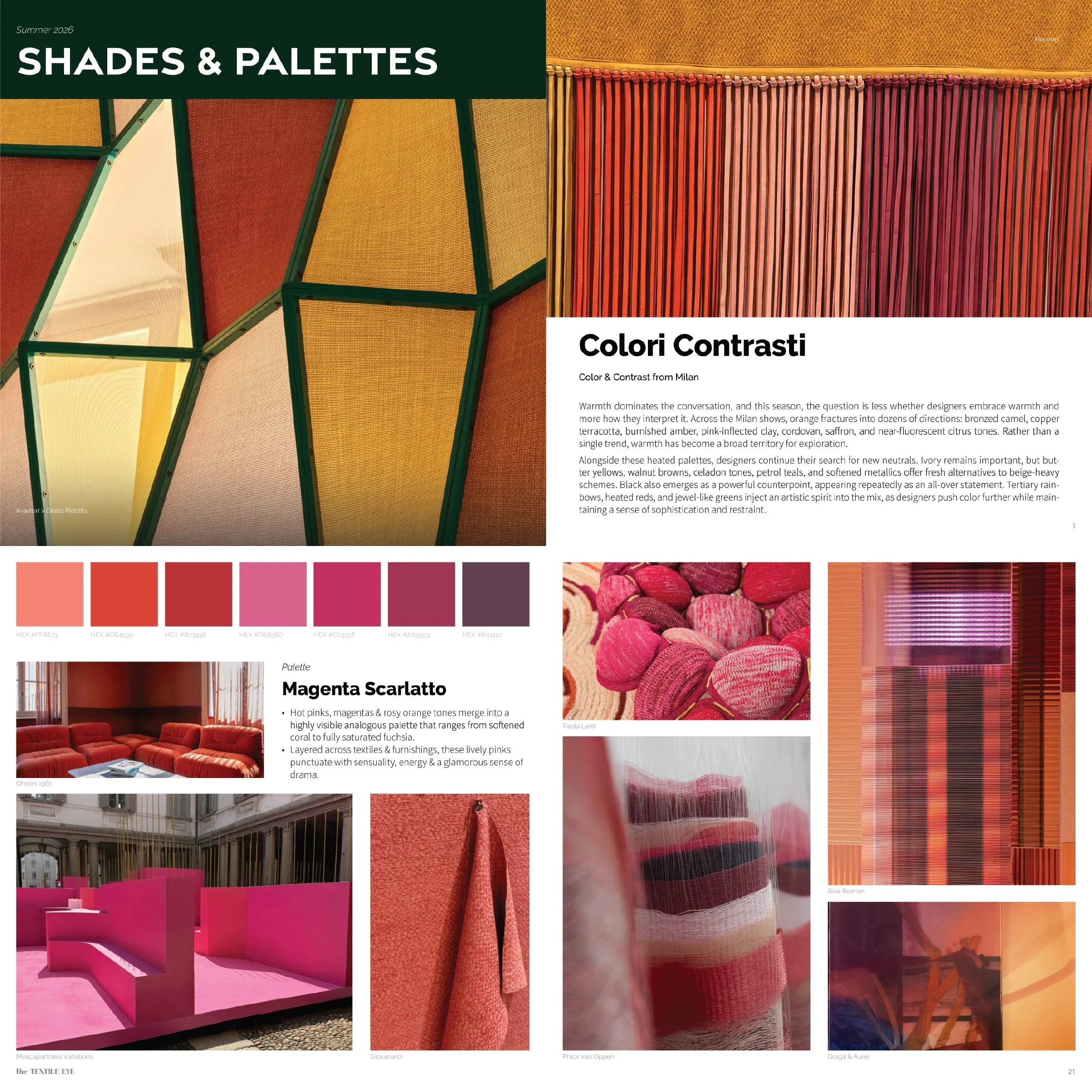
Colori Contrasti is Italian for color and contrast, and the phrase sets the terms for the season. Warmth dominates the conversation: orange alone fractures into bronzed camel, copper terracotta, burnished amber, pink-inflected clay, cordovan, and saffron. Alongside the heat runs a steady search for new neutrals—butter yellows, walnut browns, hazy celadons, and petrol teals that step away from beige. Black returns as an all-over statement rather than an accent, and jewel greens, heated reds, and tertiary rainbows push the range further still. What holds the guide together is a confidence that embraces color while keeping a sense of restraint.
What's inside:
50+ pages of color direction from the Milan shows
19 named palettes and shades, from Ivory Strata and Nero Obsidian to Copper Ambra, Barolo Glow, and Emerald Lucido
HEX codes and Pantone TPG references for every palette
Treatment directions: Platinum Perlato and Psichedelico
Featured work from Hermès, Louis Vuitton, Loro Piana, Dedar, Nilufar, Paola Lenti, Kvadrat, Armani/Casa, Liberty, Kasthall, and many others
This guide is excerpted from The Textile Eye 29: Summer 2026, Materia Milanese, and is included with all paid subscriptions.
SUBSCRIBERS: Download your guide [HERE]. Download ASE files [HERE].
A download link will be sent immediately after purchase for non-subscribers. Each PDF contains a coupon code toward a full subscription as well.
The info presented in this Color Guide is included in Report No. 26 Designed to Sustain